TouchTunes Jukebox
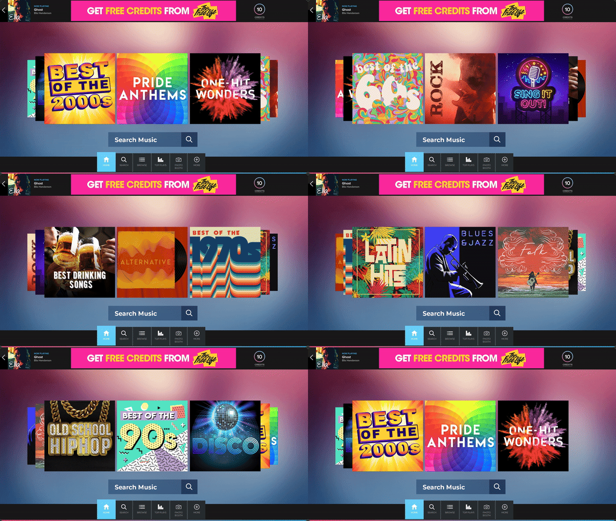
I created over 100 new playlist tiles for TouchTunes Jukeboxes which can be seen at over 600,000 locations. Each cover was designed entirely by me, none of it was templated. This project took nearly a year from planning to final execution and was part of the biggest UI redesign TouchTunes had done in nearly 20 years.

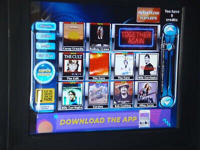
Before:

For reference, the old TouchTunes interface can be seen here. The outdated interface was clunky, hard to navigate, and TouchTunes lacked any individual brand prescence as the sceen relied on label-supplied artwork to drive plays. The redesign gave TouchTunes a fun recognizable brand and attracted users to playlists, curated and easily updated by TouchTunes internal team rather than relying on labels to drive traffic.
After:
TouchTunes’ playlists were divided into four general categories: Decades, Genres, Themes, and Latin. Due to the large Spanish-speaking TouchTunes user base, I took a crash course in Latin music to design custom tile art for each sub-genre. Check out all 100 playlists below:
Decades
Genres
Themes
Themes included top played songs across major channels, geographically targeted genres, and seasonal playlists for holidays, sporting events, and cultural events.


