PIXELS AND PRINT
Every year the Multimedia Production and Design department at Syracuse University, where I got my degree, puts on an annual workshop where all the design students collaborate on a projects that benefits the community.
In 2017 we worked with local community organizers, Tomorrow’s Neighborhoods Today, on a campaign to illuminate the beauty and history of the south side of Syracuse and encourage students to explore the what the neighborhood has to offer.
As a senior I acted as art director for my team of under graduate design students. Over the course of a weekend we designed a poster series which illuminated on six features the South Side has to offer. We printed and sold the posters to raise money for TNT who will continue to fight for funding and programs to benefit the south side’s residents.
PROCESS WORK
Over the course of the cold February weekend of the workshop, I was one of two student art directors on the Print team where I led my group of eight freshman and sophomore graphic design students to create a series of cohesive posters — each featuring landmarks of the historic south side neighborhoods.
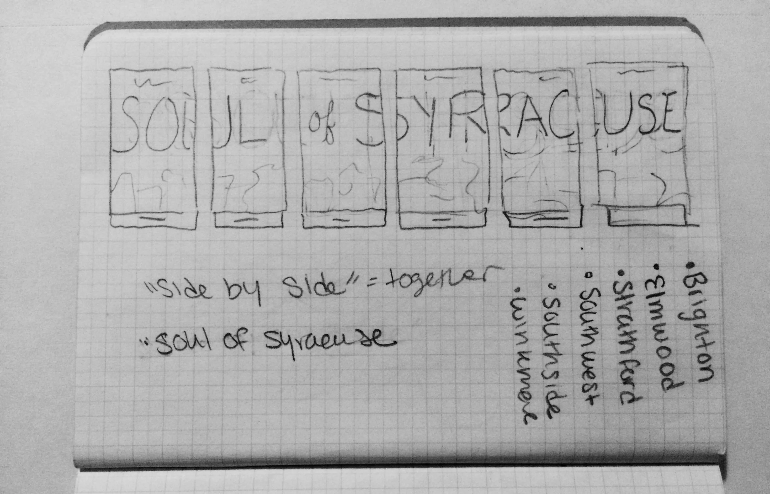
The campaign team set out to create artistic posters and merchandise that could be printed and sold. We each sat down and sketched ideas for the posters which would set the visual tone for all of our work. We came up with three poster series: one focused on businesses, one on Southside community members, and my idea which focused on the neighborhoods. I was inspired by the concept of the six neighborhoods of the Southside, each with their own personalities and unique landmarks but which ultimately come together to create a larger community.
We spent the first day of the workshop developing our ideas and prepared mockups to show our client. After receiving initial feedback from the client, our team had a better understanding of their needs. The client was most drawn to my initial idea and wanted to focus on highlighting the six neighborhoods bringing them together to create a more united community.
ART DIRECTION
After some deliberation we decided on 1-3 landmarks to recreate for each poster. The entire campaigns team worked together to illustrate the landmarks, which became our key art for the rest of our deliverables.
I took on the role of art director and led my team members in executing the entire series in one day. The greatest challenge of the workshop, aside from the time crunch, was working with designers who had limited or no experience in Illustrator. After delegating the more intricate landmarks to more experienced designers, I sat down with two new designers and walked them through the program, acting as both teacher and mentor.
While the team worked away on the key art, I began recoloring and editing the illustrations so that they would flow from panel to panel. The final color scheme was inspired by sunset tones, representing the light shining down on the city.


