Throne Kingdom
Branding Case Study
The Client
Throne Kingdom is a family-owned business who is currently the US’s largest maker and seller of thrones. Their primary customer includes film and TV giants HBO and Disney, rappers Nicki Minaj and DJ Khalad, and other eccentric personalities looking for a unique furnishing for thier home. When I first began working with Throne Kingdom, their branding looked cheap and outdated – nothing like the product they sell.


Research
My first step in creating any brand is always gathering inspiration. The client was extremely open to pursuing a lot of eccentric creative directions and said they wanted to see options that were fun but practical. The key phrase was sophisticated luxury. However, when asked what brands the clients most admired they cited Restoration Hardware, GAR products, and Thursday Boots – all brands that are more rustic and minimalistic than what Throne Kingdom suggests they actually want.
I took to Pinterest and saved hundreds of fonts, colors. textures, and affinity branda that spoke to Throne Kingdom’s potential. I explored rabbitholes, gathering lots of variations on a theme until I felt satisfied I had enough references to work from, until moving on to the next concept.
From there I was able to begin pulling specific source images, and combining them with fonts, textures, product imagery, and affinity brand references to start crafting directions to be pitched to the client.
Meanwhile, I met with the creative director and copywriter for the project, touching base on their progress with developing the new language for the brand. This began to create a clearer direction for me to pursue while developing brand concepts for presentation.
The key words the client kept returning to were regal, bold, loyalty, romantic, and unapologetic.
Mood Boards
In total we presented eight unique brand directions to the client in the form of mood boards.
Three of those concepts were inspired by the aspirational brands the client had mentioned to use (Restoration Hardware, Thursday Boots, and GAR products). These boards featured modern interior design photography, sleek fonts, neutral airy colors, and dark undertones.
1. Neutral, airy elegance
(Inspired by Restoration Hardware)
2. Sleek Minimal
(inspired by GAR Products)
3. Dark Flourishes
(inspired by Thursday Boots)
For two concepts I pursued takes on modern regality – one in black and white and one in green – utilizing expensive textures and moody photography. I wanted to build upon the lion throne kingdom used in their current mascot but bring the brand to a place that felt sophisticated and sexy.
4. Emerald Fineary
5. Regal Noir
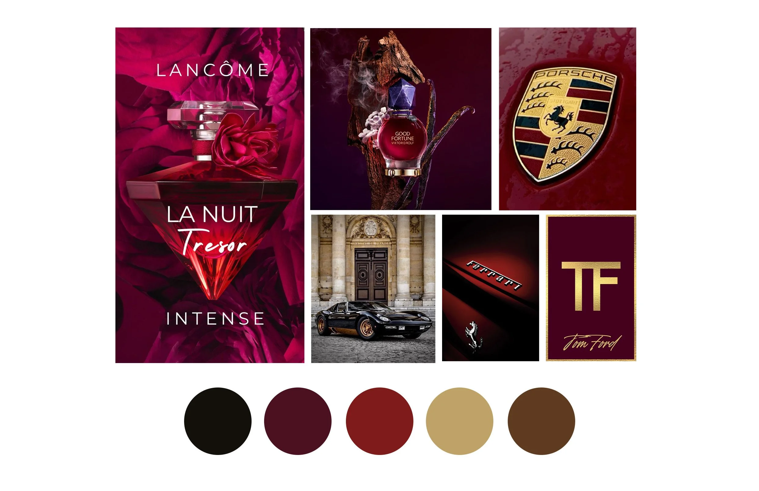
As I researched I kept coming back to luxury car brands like Ferrari and Jaguar whose brands rely on a recognizable mascot. I built this concept around rich colors, masculine features, and practical luxury like the cars themselves. This brand felt particularly aspirational yet attainable.
6. Luxury Mascots
Additionally, I was inspired by the hand crafted elegance in each throne the client manufactures. It reminded me of the elevated handcraft we see from modern luxury designers like Hermés. This concept explores the simplistic elegance of embossed type, hand-drawn patterns, supple leather, and a bold accent color.
7. Handcrafted Elegance
My final concept was a wild card option. I was inspired by the story of this family own business. Founder Allen Kraiem’s father was a furniture maker who immigrated from Egypt to Brooklyn, NY in 1952. Kraiem owned a retail store selling everything from Asian-imported furniture, to rugs, to electronics. Allen grew up working at his dad’s store a learned what makes for high quality luxury pieces before starting his company which he runs with his son with the help of other family members. The unique brand history deserved to be highlighted and I pulled inspiration from North African motifs, pulling great inspiration from funky Moroccon patterns and desert colors.
8. Funky Moroccan
The client immediately loved the Luxury Mascots and Hand Crafted Elegance directions, and without any additional creative changes necessary we began developing brand aspects.
Logo Design
For each brand direction, I developed two logo directions. The client was committed to keeping the lion motif from the existing logo, so playing with how the mascot could interact with the type was key. I explored a range of type that had different energy and feel, designing a logo that felt like it could be the first piece of personality for the brand even on its own.
Fortunately, the client happened to love my favorite of the concepts (6. Royal Heraldry). I explored a few alternatives to the classic lion, trying to build out motifs that developed to be adaptable iconography to create patterns and textures for the brand down the line. However, the client kept coming back to the original lions with the crossed tails that I had developed for the first logo they saw.
Final logo
Brand Identity
While the client approved the final logo, they were still between a couple different aesthetic directions. They loved the previous moodboards for both Luxury Mascots and Funky Moroccon.
The next step in the brand development process is determining the rest of the visual elements for the brand – fonts, colors, and textures. Taking the newly approved logo and both brand mood boards, I created two directions for the client to choose between.
Final Brand Identity
The client ended up loving the Luxury Mascots option and became the final brand! Below is the fleshed out brand ecosystem for Throne Kingdom


