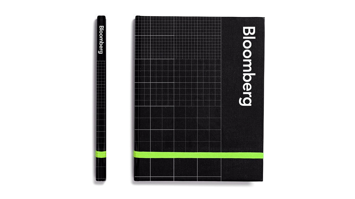
Bloomberg
Global Office Rebrand
During my time at Bloomberg’s creative studio I worked primarily on a global redesign project where the goal was to develop a strong visual voice to create cohesion and unity across Bloomberg’s 170+ offices. Each design was intended to increase brand recognition by reflecting Bloomberg’s core values, goals, and achievements.


I worked alongside a handful of marketing associates and two other designers to create new refreshing branding that would work in a range of spaces. For example, we had to consider what kinds of designs would work best on large solid walls, glass, dark spaces, light spaces, and even wrapping around corners. Now these designs are displayed in offices all around the world.
One original concept I was proud to present was the above piece titled “Global Connectivity”. I was inspired by Massimo Vignelli’s original MTA subway map design as well as my my daily struggles navigating the New York City subways for the first time. The ultimate goal of this flat was to communicate not only the great number of office locations, but to demonstrate the how information and ideas are shared globally.
Not only was this flat my personal favorite, but Michael Bloomberg said it was his favorite as well!


